
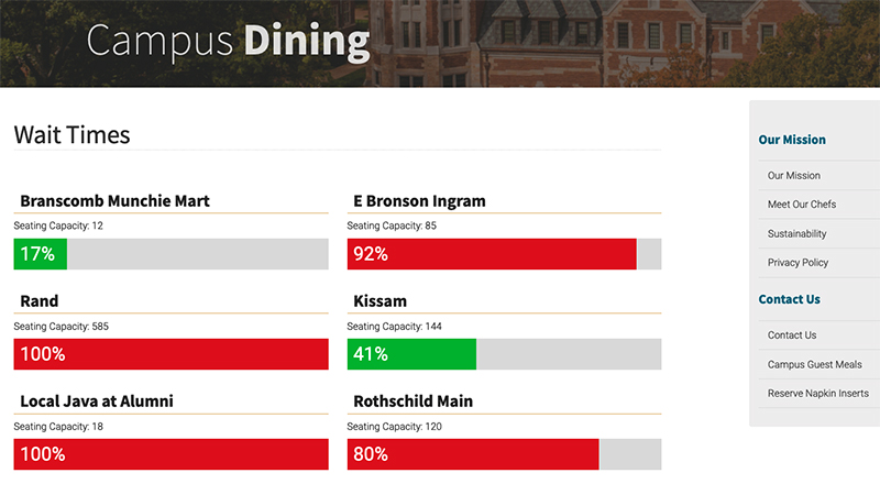
This is a project that I worked on for the Office of Campus Dining at Vanderbilt University. The purpose is to display live capacity data for the many dining facilities across campus. The live data comes from an API developed by a company called Occuspace that provided the sensor technology installed in each facility.
CSS
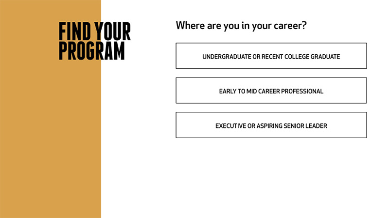
Simple Decision Tree
This is a simple interactive decision tree that I built for the Owen Graduate School of Management at Vanderbilt.

Vertical Pagination
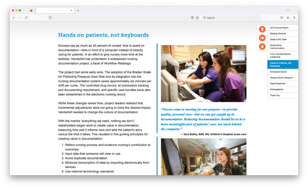
This is a light weight plugin that I developed which allows for multiple stacked content panels on a single page. A sticky navigation control will adjust automatically based on the number of panels used. Arrows in the control advance the current panel up and down and a block in between them will expose a full menu so that the user can choose a panel anywhere in the stack. I also developed a version of this — xyPanels — that includes an optional line of horizontal panels along each point in the vertical stack. In addition to the demo, I also have a working example of this for the Vanderbilt Nursing Report.

Vanderbilt Nursing Report
This is something that I built with a colleague at Vanderbilt University. It also serves as a working example of one of my personal projects — Vertical Pagination.
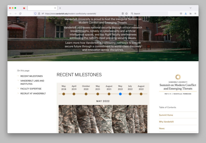
Summit Webpage
This is a small part of a larger project that I worked on with several other people at Vanderbilt and features a simple interactive timeline along with other page elements.
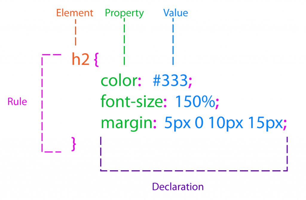
CSS Anatomy and Terms
I have been coding CSS for quite a while but still seem to forget the exact terms used for describing the different parts of a CSS rule.

xyPanels
This is a plugin that I developed as a twist to single page website designs and a variation on one of my other projects — Vertical Pagination. Most of the heavy lifting is done by jQuery but I am planning to replace certain functions with modern CSS (such as the Flexbox) in the future. xyPanels also operates “outside” the layout and can be used with “inside” front end frameworks such as Bootstrap.
Applying Opacity to a Container But Not Its Contents
Another quick and easy technique which eludes some of us! While the use of rgba for background colors is not supported by all browsers, it can still be used with a fallback:
div {

/* Fallback to solid white */

background: rgb(255, 255, 255);

/* White with 50% opacity */

background: rgba(255, 255, 255, 0.50);

}

div p {

/* Text inside the div will render at 100% opacity */

color: #000;

}
Just remember that the fallback should be declared first since the last instance of a property (that the browser understands) takes precedence.
Page Content Filtering Using CSS and jQuery
This is something that I first created for a project at Vanderbilt University when this type of filtering was less common than it is now. The basic idea is to have a keyword match input field on a page that filters page content for the user without making a server request and reloading the page.
Some thoughts on what to do with this:
- Use to filter list items (as in my example), images, table rows or any type of container.
- The text that gets targeted by the filter can be hidden (as in my example) or exposed.
- What happens to matches (or non-matches) can vary according to the added (or removed) class and what it triggers (a style change or a jQuery effect for example).
Containers and Percentage Widths
I wanted to clear up something that is fairly basic but tripped me up a little when I started coding more responsive layouts. Whenever you apply a width value to a container its values for padding and margin get added to that value. In the following example the container element will actually be 640px — breaking its 600px wrapper:
<style>

.wrapper {

margin: 0 auto;

width: 600px;

}

.container {

width: 100%;

margin: 10px;

padding: 10px;

}

</style>
<div class="wrapper">

<div class="container">

<p>Lorem ipsum dolor sit amet, vix blandit epicurei verterem ad. Id sit mazim habemus platonem, at putant erroribus per, wisi autem rationibus eum cu. Ea est prodesset scripserit, in eos dicunt mentitum maluisset, pri ut timeam accusamus. Sed nominavi concludaturque an.</p>

</div>

</div>
In order to keep the container at 600px you can do some math and set its width to 560px which will allow for the added padding and margin — however — doing that with percentages will give you some unpredictable results based on the browser size.
The correct way to do this is to have two containers — one with a percentage width and one with fixed values for padding and margin:
<style>

.wrapper {

margin: 0 auto;

width: 600px;

}

.parent-container {

width: 100%;

}

.child-container {

margin: 10px;

padding: 10px;

}

</style>
<div class="wrapper">

<div class="parent-container">

<div class="child-container">

<p>Lorem ipsum dolor sit amet, vix blandit epicurei verterem ad. Id sit mazim habemus platonem, at putant erroribus per, wisi autem rationibus eum cu. Ea est prodesset scripserit, in eos dicunt mentitum maluisset, pri ut timeam accusamus. Sed nominavi concludaturque an.</p>

</div>

</div>

</div>
And remember that top and bottom margins collapse whereas left and right margins do not.

Accordion Menus
When they first came into use, accordion menus took a lot of coding but now they are quite simple to create. This very simple and super light plugin will close open accordions when another one is opened and does not rely on CSS hover classes since they can be problematic on mobile devices.
IE and Compatability Mode
UPDATE: At the time of this posting (2013) my team was still having to test for IE6 and IE7 so, hopefully, it will not be relevant for anyone reading it now. But just in case:
Compatibility mode in IE was — to my understanding — meant to allow obsolete web applications to render correctly by simulating an outdated version of the browser. For an ordinary person this option should not be set by default, however, some larger organizations that distribute hundreds of computers at a time may have it chosen as part of the profile they imprint on each system.
Nonetheless, there is a way to protect your CSS3 and HTML5 from compatibility mode! Just put this additional meta tag in your <head> before the other meta tags and it will disable compatibility mode as an option when people visit your site using IE by forcing it to use its most current rendering engine:
<meta http-equiv="X-UA-Compatible" content="IE=edge">