WordPress Custom Meta Box Tip

How to Keep Your WordPress Custom Meta Box Key and Value from Appearing in the Custom Field List

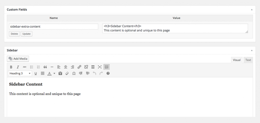
A client recently asked me for a second visual editor for a page template that would allow them to put extra content in the sidebar. This was pretty easy to do using the WordPress add_meta_box() function but I noticed that the content was also appearing in the custom field list (along with its key) which I did not really want.

Meta

I spent a while trying to figure out how to avoid this duplication and it came down to a subtle naming convention for meta keys that I found a reference to in the WordPress Codex:

If you are a plugin or theme developer and you are planning to use custom fields to store parameters related to your plugin or template, it is interesting to note that WordPress will not show custom fields which have keys starting with an "_" (underscore) in the custom fields list on the post edit screen or when using the the_meta() template function."

Editing HTACCESS in Mac OS X

Sometimes you need to be able to edit .htaccess and other hidden files in your local development environment. First you need to expose hidden files by launching Terminal and executing the following command:

defaults write com.apple.finder AppleShowAllFiles YES

Next you need to relaunch the Finder (command-option-esc).

Import .htaccess from your web server directory, make a backup and then rename the original file “htaccess.txt” so that you edit it in TextEdit or some other text editor.

After making your edits, do the following:

    1. Upload “htaccess.txt” to your web server directory
    2. Delete “.htaccess” from your web server directory
    3. Rename “htaccess.txt” to “.htaccess”

Applying Opacity to a Container But Not Its Contents

Another quick and easy technique which eludes some of us! While the use of rgba for background colors is not supported by all browsers, it can still be used with a fallback:

div {
/* Fallback to solid white */
background: rgb(255, 255, 255);
/* White with 50% opacity */
background: rgba(255, 255, 255, 0.50);
}
div p {
/* Text inside the div will render at 100% opacity */
color: #000;
}

Just remember that the fallback should be declared first since the last instance of a property (that the browser understands) takes precedence.

PHP Classes and Functions

PHP classes are part of object-oriented (as opposed to procedural) PHP programming. They store reusable code — just like CSS classes — and are used for representing data as objects that can contain different types of variables (properties). Here is a very short and very simple example of how to use a function (method) inside of a PHP class:

class myClass {
public function myClassFunction($firstName, $lastName) {
echo '<p>Hello ' . $firstName . ' ' . $lastName . '</p>';
}
}
// Call an instance of the class
$myClassInstance = new myClass;
// Call a function from the class
$myClassInstance->myClassFunction('Carlos', 'Ruiz');

This will output “Hello Carlos Ruiz.”

In this example it would make more sense to just use the function by itself, however, classes are great for organization in larger web applications. As mentioned before, classes are objects that can contain many different types of properties and methods — offering more flexibility if your project is fairly robust.

Containers and Percentage Widths

I wanted to clear up something that is fairly basic but tripped me up a little when I started coding more responsive layouts. Whenever you apply a width value to a container its values for padding and margin get added to that value. In the following example the container element will actually be 640px — breaking its 600px wrapper:

<style>
.wrapper {
margin: 0 auto;
width: 600px;
}
.container {
width: 100%;
margin: 10px;
padding: 10px;
}
</style>

<div class="wrapper">
<div class="container">
<p>Lorem ipsum dolor sit amet, vix blandit epicurei verterem ad. Id sit mazim habemus platonem, at putant erroribus per, wisi autem rationibus eum cu. Ea est prodesset scripserit, in eos dicunt mentitum maluisset, pri ut timeam accusamus. Sed nominavi concludaturque an.</p>
</div>
</div>

In order to keep the container at 600px you can do some math and set its width to 560px which will allow for the added padding and margin — however — doing that with percentages will give you some unpredictable results based on the browser size.

The correct way to do this is to have two containers — one with a percentage width and one with fixed values for padding and margin:

<style>
.wrapper {
margin: 0 auto;
width: 600px;
}
.parent-container {
width: 100%;
}
.child-container {
margin: 10px;
padding: 10px;
}
</style>

<div class="wrapper">
<div class="parent-container">
<div class="child-container">
<p>Lorem ipsum dolor sit amet, vix blandit epicurei verterem ad. Id sit mazim habemus platonem, at putant erroribus per, wisi autem rationibus eum cu. Ea est prodesset scripserit, in eos dicunt mentitum maluisset, pri ut timeam accusamus. Sed nominavi concludaturque an.</p>
</div>
</div>
</div>

And remember that top and bottom margins collapse whereas left and right margins do not.

IE and Compatability Mode

UPDATE: At the time of this posting (2013) my team was still having to test for IE6 and IE7 so, hopefully, it will not be relevant for anyone reading it now. But just in case:

Compatibility mode in IE was — to my understanding — meant to allow obsolete web applications to render correctly by simulating an outdated version of the browser. For an ordinary person this option should not be set by default, however, some larger organizations that distribute hundreds of computers at a time may have it chosen as part of the profile they imprint on each system.

Nonetheless, there is a way to protect your CSS3 and HTML5 from compatibility mode! Just put this additional meta tag in your <head> before the other meta tags and it will disable compatibility mode as an option when people visit your site using IE by forcing it to use its most current rendering engine:

<meta http-equiv="X-UA-Compatible" content="IE=edge">